Brand Refresh: Pangea Park
With the slogan “Denmark’s coziest wildlife park” (“Danmarks hyggeligste dyrepark”), Pangea Park promises a more intimate experience that reconnects people with nature, with themselves, as well as the ones around them.
Pangea Parks main goal is to offer a closer experience with its animals, compared to a regular ZOO. In this small park located on Sjælland, families could get together by having fun in nature, looking at the various animals and attending the live shows – where they were shown various animal species, get interesting facts from supervisors and interact safely with the animals presented.
What did Pangea Park need to communicate their message more effectively?
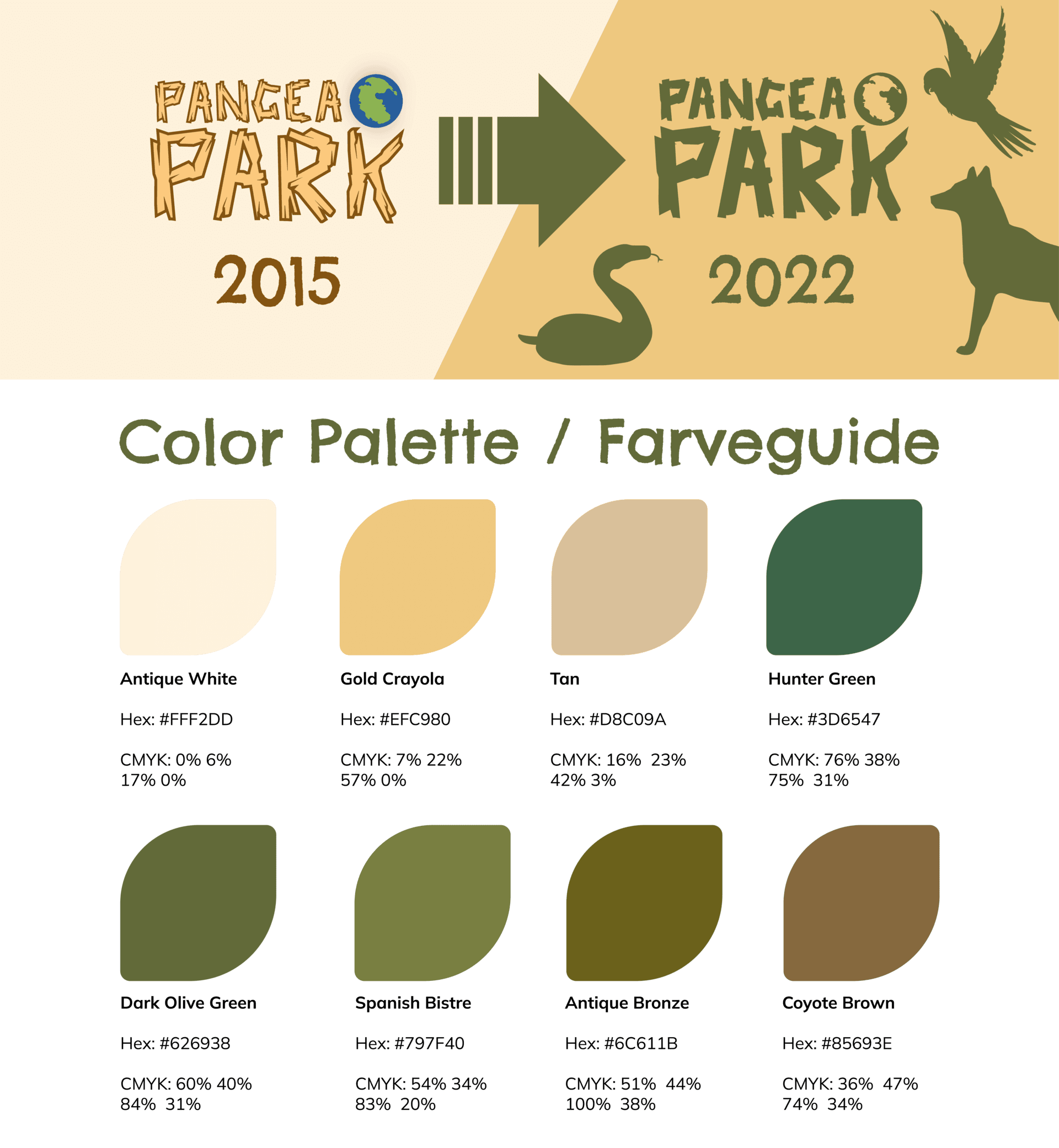
Plainly put, a new face. The existing design was reminiscent of the 90’s Discovery Channel like style, with motifs such as the well-known earth globe icon, font made in the shape of three branches – essentially all the elements that show the raw beauty of our world.
The design had a more nostalgic tone to it, which could have worked, if that was the need it was addressing. Yet here the need was to cater to families, comprised of various members of different age groups. And the benefit of visiting Pangea was that all these different family members can find joy and form a closer connection, with the help of common activities in nature.
There is no such thing as “bad” or “good design”, actually. Form follows content, in this case the message was just not represented with the right visual style, that would appeal to the desired audience.
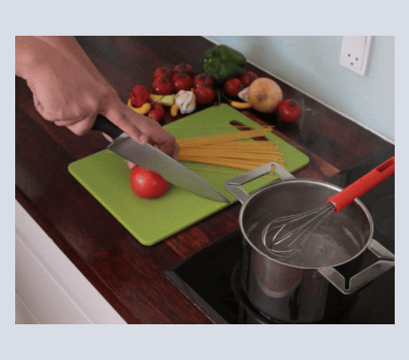
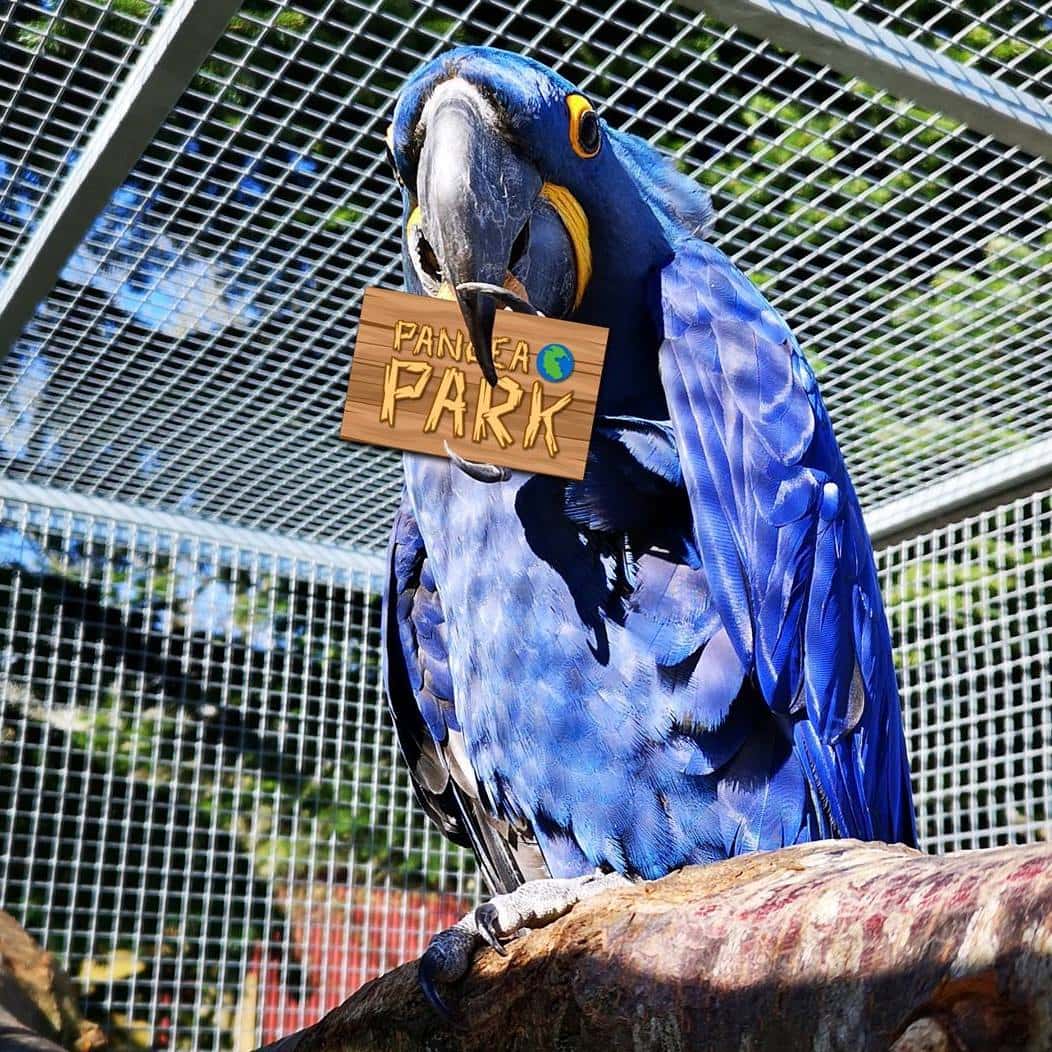
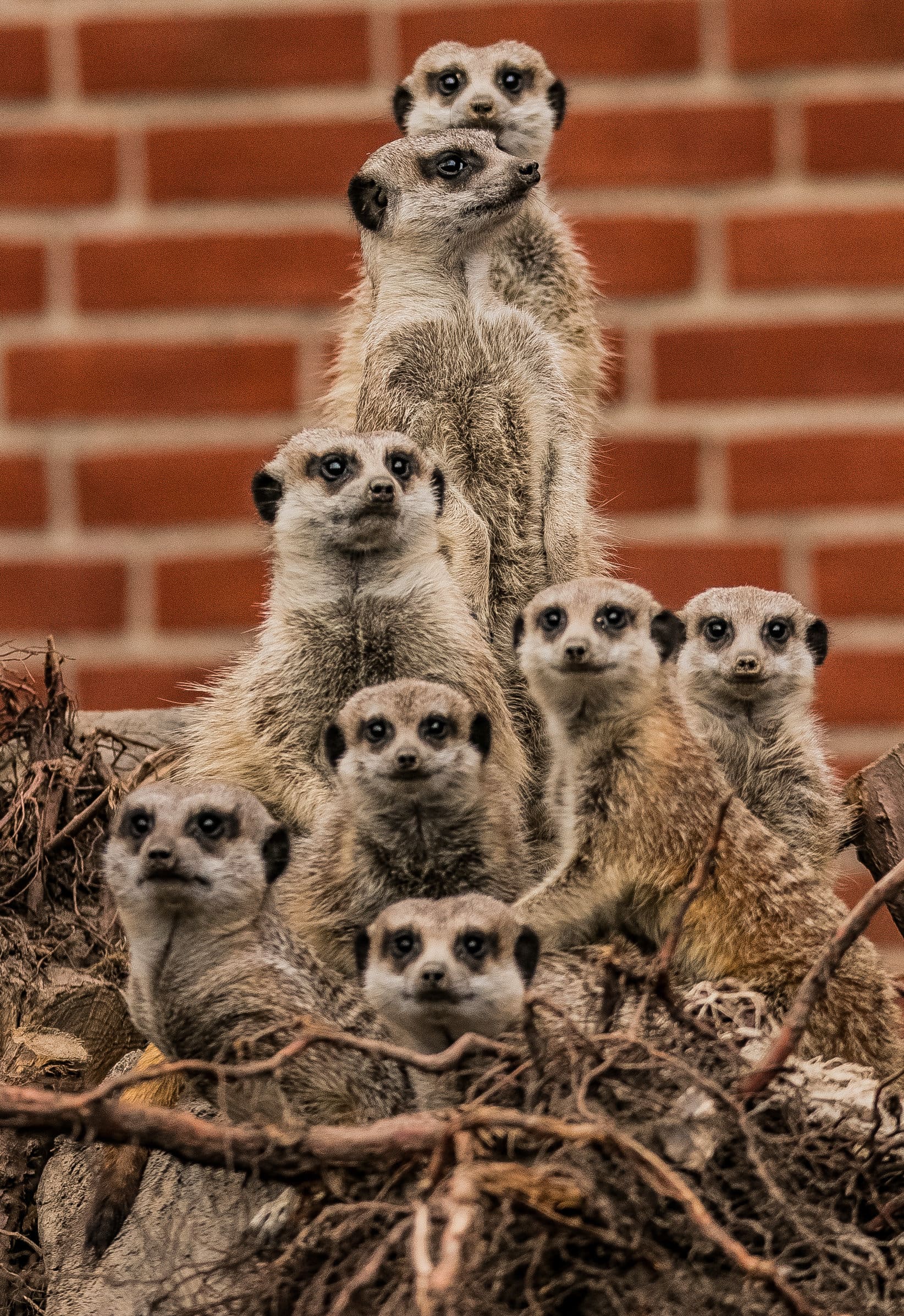
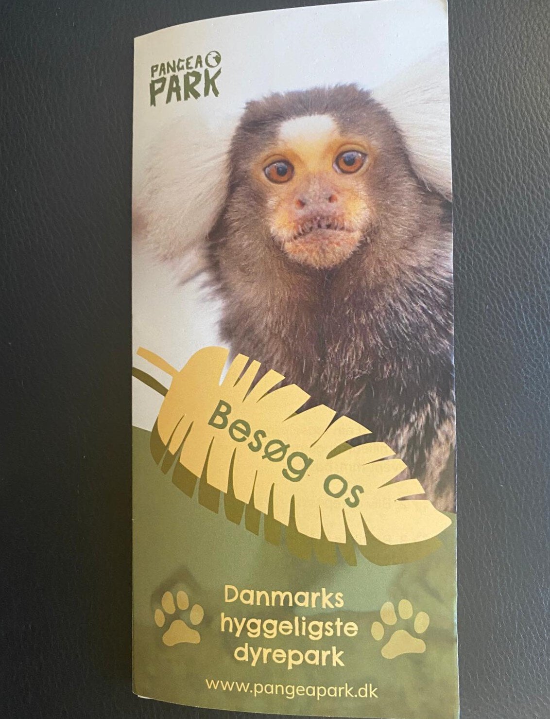
***Aside from the mockups and designs, the pictures of the park and animals are Pangea Parks property. The client had a good collection of professional photographs, which he sent over at the beginning of the project. Some pictures were saved from their Facebook page as well***
There are more ways than one to do a rebrand
In this case it made sense to go for a brand refresh, as the elements were there, the message was solid, and they already had recognition from their target group. The only thing missing was a red thread in the design. The first steps were to look at other parks from all over Denmark, to identify relevant trends and get some inspiration on how they use design to craft their message. It was notable that the general tendency, in all parks I looked at, was for a simplified design, with solid colors, yet playful.
The same good concept – with a more modern look
For the first I have simplified the logo by reducing it to its main shapes, all extra colors and effects had been removed. This way one solid color can be applied and then it can be integrated in various designs and places.
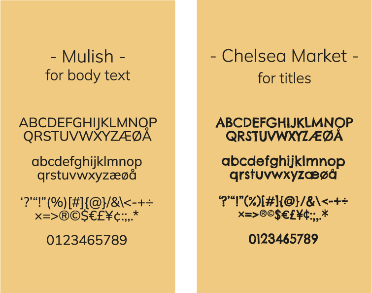
The original color scheme and fonts were reorganized as well, the green that they had been using originally was paired with a vibrant ochre and a few earth colors to balance them out in layouts. The previous font, “Chelsea market”, was kept for headlines and short texts. The font has this organic vibe to it and the slightly gritty/unpolished appearance gives the feeling of something hand made. This font was paired with “Mulish”, a google font that is simpler and that is perfect for big text paragraphs as it’s easy and fast to read. The existing icons that presented animal silhouettes and footprints have been kept as they could be re-adapted in the new design; the question was only in which way.
Time to play
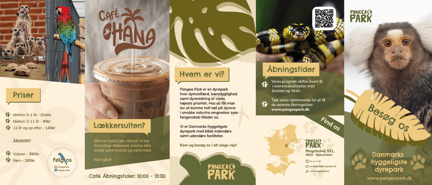
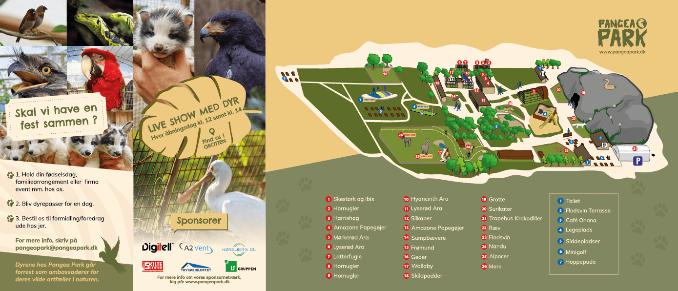
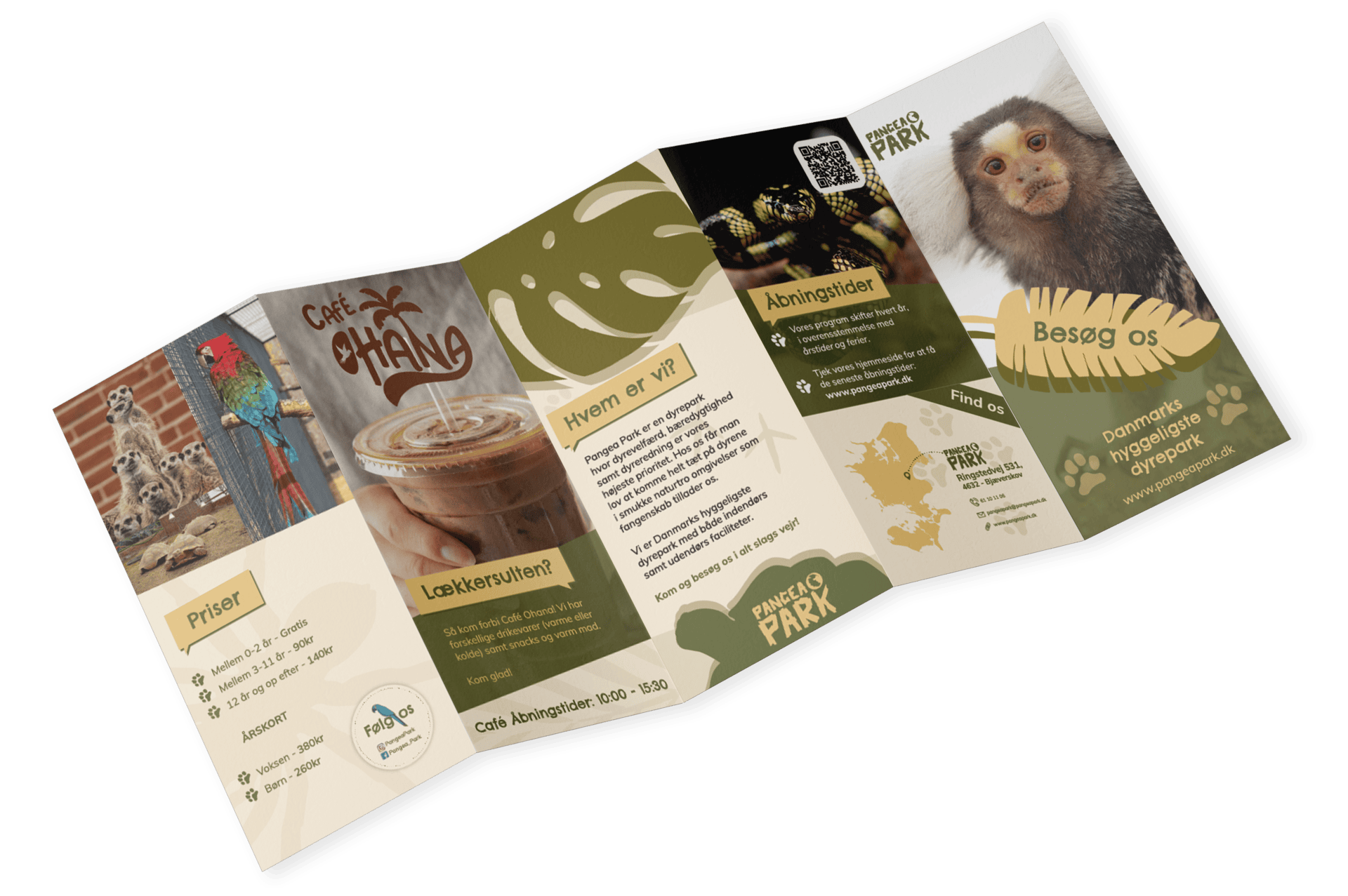
Now that the basic design elements have been created, it was time to test various combinations of fonts and colors through practical brainstorming. I played around with a brochure that presents what Pangea Park is about and that also offers an overview of the park.
After the base was created, the brand refresh concept has been sent along with the final brochure draft. The idea was received with a lot of enthusiasm, and I have been encouraged to work further with it. As such a brand manual emerged, as well as new designs for their existent signs in the park (including the signs which explained what each animal was) and more materials for offline/online marketing.
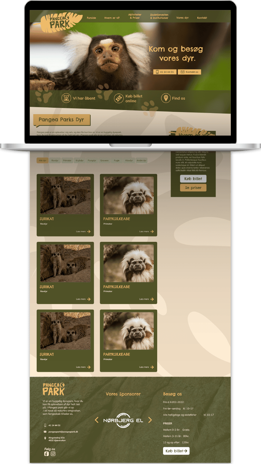
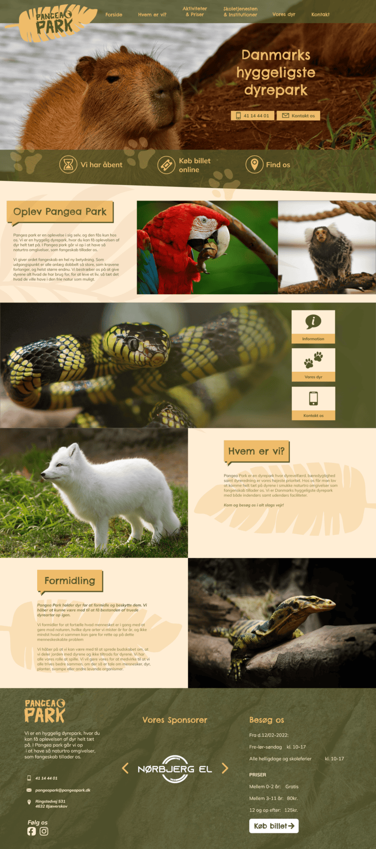
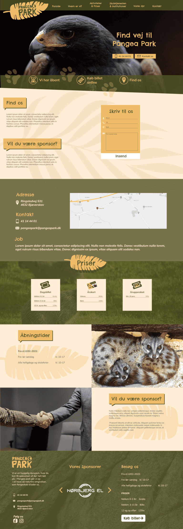
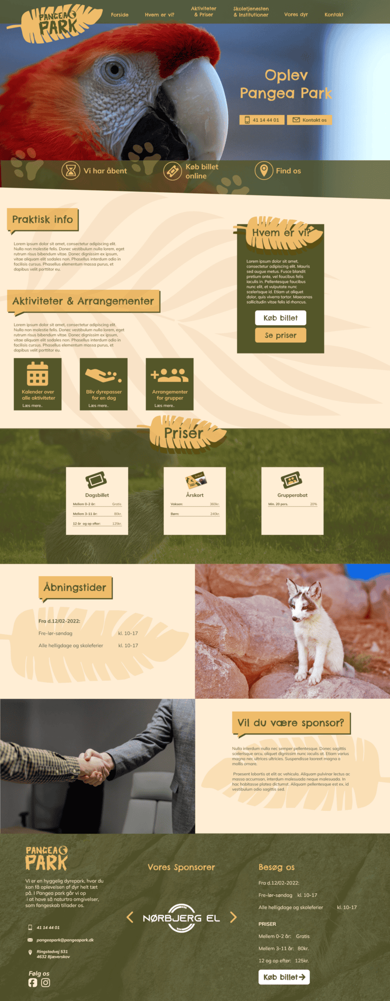
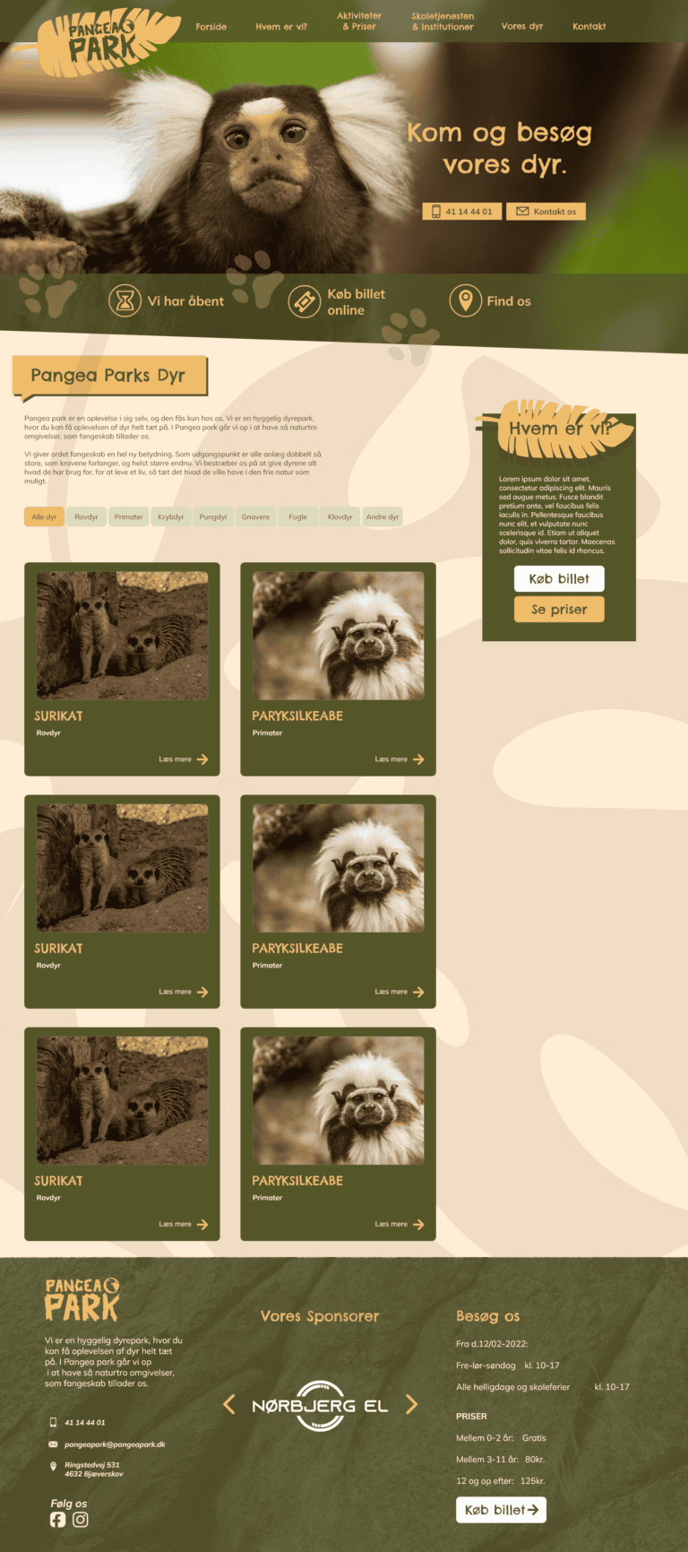
Website (re)design
The biggest project in this case, aside for the rebranding, was the updating of their existing website, so that it fits with the new identity. The website mockups created in Adobe XD can be explored here.
How can the success of this project be measured?
Here it is important to reflect on what purpose this design project had. For this case, the role of the design was to offer an identity in which the customer feels represented and that offers them confidence in the way they advertise their service offering.
This brand refresh had the benefit of showing the client possible new ways of promoting themselves. They started asking for more materials to be created such as posters, exhibition stands and even requested a redesign on their membership cards.
You might also want to read about..
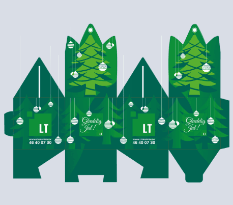
Christmas Packaging Design
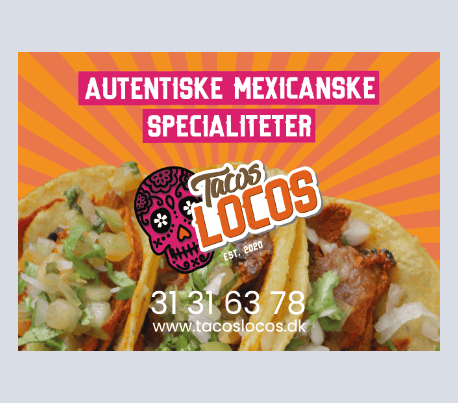
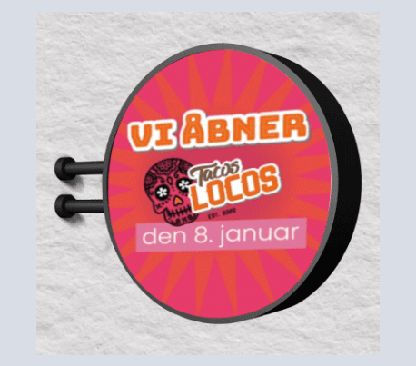
Food Truck Design (Tacos Locos)
Video Animations (After Effects)
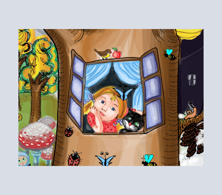
Digital Illustration: Seasons of Daniela Krolupperová’s Stories
Raising Awareness on the Dangers of Alcohol Marketing to Youth